luft font
(die) luft or air, breeze. This new font’s name encapsulates the unique glyph set development on this site with..
- the ascending cap height lower case l introduced with the galley font (and till now, my default KOReader font)
- the unique (AFAIK) reversed asymmetric lower case t introduced with the licht font in 2024
- the toothless rounded lower case u—one of the dyslexia focused non-mirrored glyph shapes—introduced with the monolexic font and further expanded since 2021 to include the lower case b d p q and n m u glyphs (contrary to the glyph symmetry most fonts pursue)
- and now, the ascending cap height lower case f.
ascending f
Just as the ascending cap height serifless lower case l uniquely distinguished the glyph from the serifless capital I (in my general bias towards geometric typefaces), the ascending cap height lower case f increases the x-height gap between the letter’s crossbar and the ascending portion of the stroke to provide the glyph shape more “air”.

If one examines the lower case f of the luft and galley fonts, the glyph, unrestrained by the typeface cap height, no longer looks “squished” in comparison.
While the previous fonts from this site are highly readable with their standard cap height, this new relaxed glyph simply disappears—a tribute to its pleasing and more natural shape. It remains unobtrusive despite breaking the cap height, as it is still less pronounced than the ascending cap height lower case l (pronounced for separation from the serifless capital I)—both exceptions, adding to the unique character of the font.
letter heights
Aside from the luft typeface’s distinctive non-mirrored glyph shapes (save for the serifless capital I and ascending lower case l), the lower case letters now uniquely cover six heights—increasing from the x-height of a c .. z, the reversed asymmetric t, dotted i j, cap height b d h k, the ascending f to the ascending l—rendering a subtle visual rhythm to lines of text.
Additionally, the luft font glyph set now encompasses the full UTF-8 symbol set—dingbats, mathematical symbols, etc.—similar to the Noto Sans Font (for potentially greater ebook compatibility).
‧ ‧ • ‧ ‧
Dare i say.. this has become my end game serifless ereader font with its relaxed (tuned) monospaced visual cadence :)
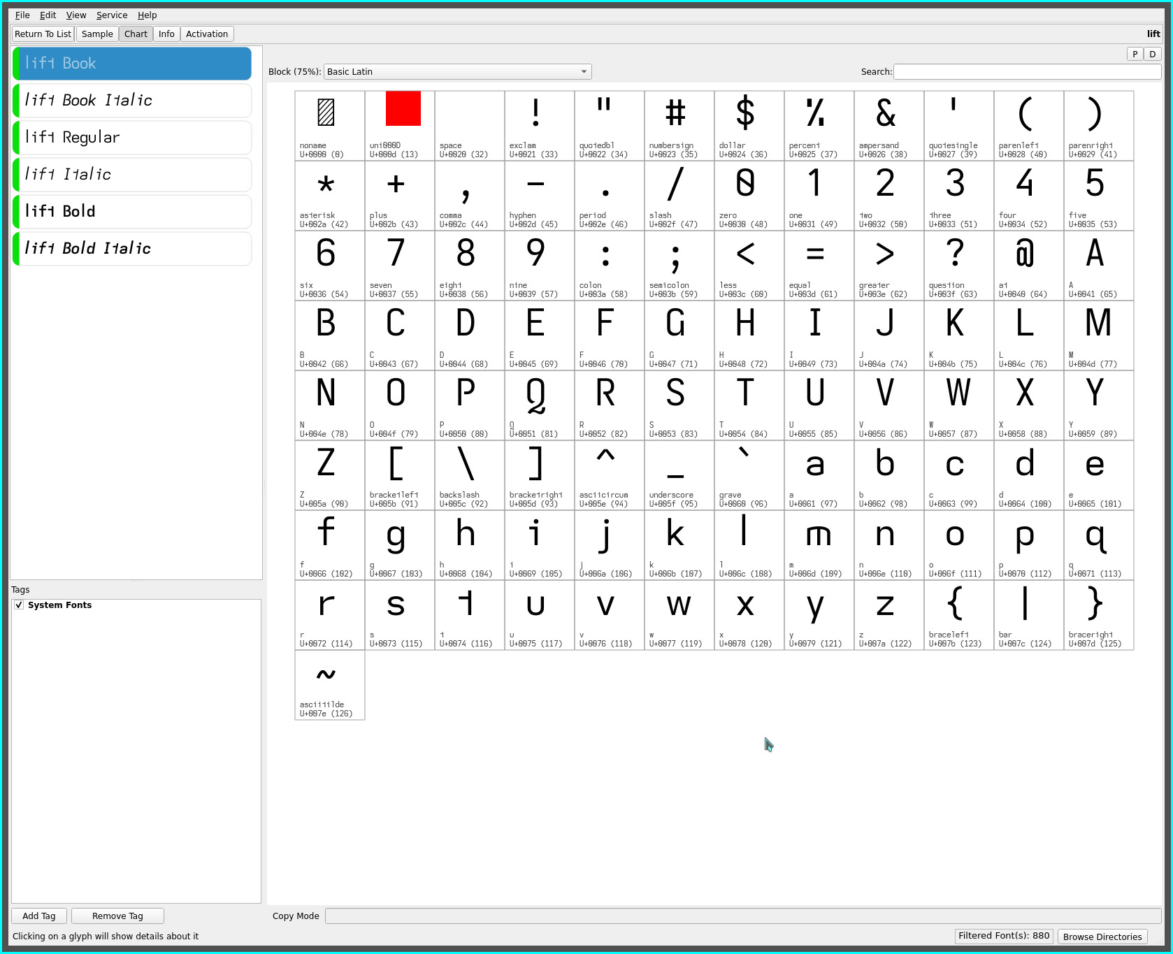
lift font
while the ascending lower case l was created to distinguish it from the serifless cap-height capital I, the serifed capital I remains the more dyslexic legible glyph shape.
For those not as predisposed towards serifless typefaces, the repos contain the lift font—the luft font variant with all its distinguishing letter heights plus a serifed capital I and serifless (hooked) capital J (in a nod to the Atkinson Hyperlegible Font).

repos
This font may be found on OneDrive.